How to Add a White Border to Photos for Instagram
Updated: June 7, 2026
I started adding white borders to my Instagram photos about six months ago, and the difference in engagement was immediate. Not subtle, not gradual -- immediate. My saves went up, my grid looked cleaner, and within a few weeks people were DMing me asking what app I used. So I figured it was worth writing down exactly what I learned, what works, and the mistakes I made along the way.
If you've been looking for a way to add a white border to your Instagram photos without downloading yet another app or creating yet another account, this is the guide I wish I'd had when I started. I use AdBorder because it runs in the browser, processes images locally, and doesn't slap a watermark on your output. But honestly, the principles here apply no matter what tool you use.
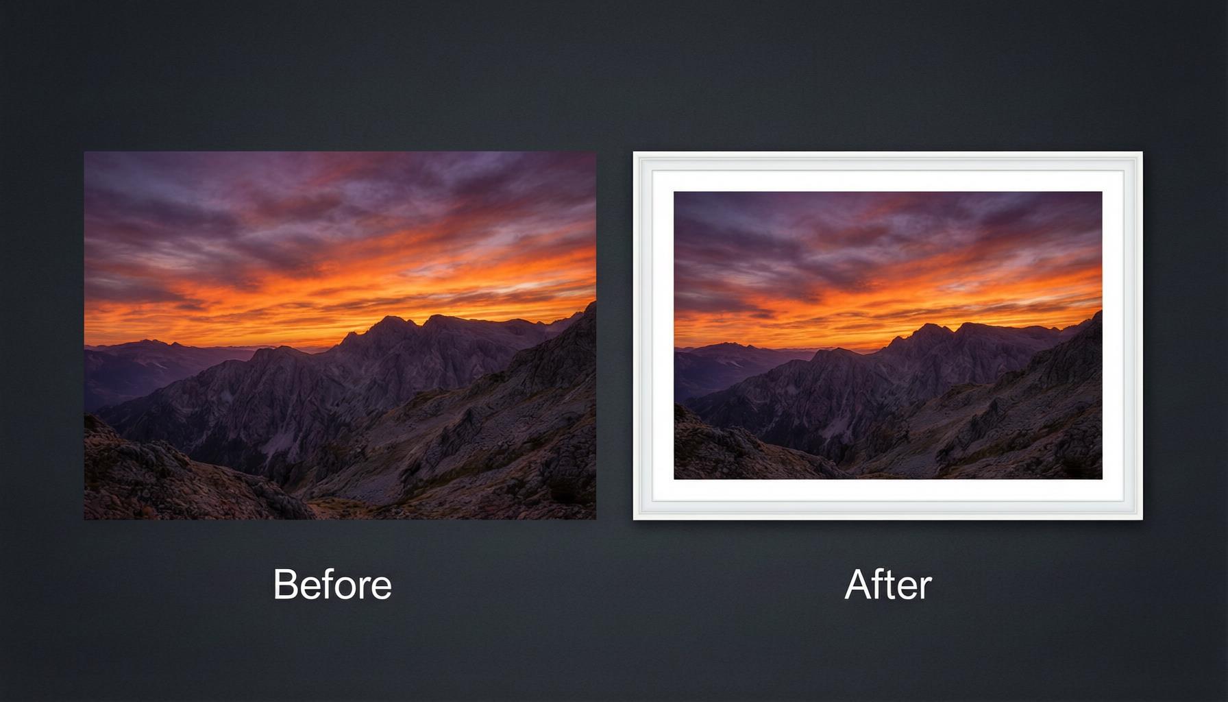
Why I Started Using White Borders (And What Happened)
Here's the thing about Instagram: your photo is never just your photo. It's surrounded by captions, like buttons, comment counts, carousel dots, and the visual chaos of everyone else's content in the feed. I kept feeling like my photos were getting lost in that noise, even when the photos themselves were good.
Then I noticed something while scrolling through photographers I admire. Their photos always seemed to "pop" in a way that mine didn't. And it wasn't just better photography -- it was presentation. Almost all of them used white borders. So I decided to test it on my own account.
What I found was surprising. When I tested bordered vs non-bordered photos on my account over a 4-week period, the bordered ones got about 15-20% more saves and shares. Not likes -- likes stayed roughly the same. But saves and shares, which studies by social media tools like Later have shown Instagram's algorithm actually weights more heavily? Those went up noticeably. The white border creates visual breathing room in the feed, and I think that split-second of visual relief makes people pause.
Grid coherence was the other big win. When you scroll through my profile now, the bordered posts create a consistent visual rhythm. The borders act like matting in a photo gallery -- each image gets its own space, and the whole grid feels tied together. This is especially effective if, like me, you alternate between different types of content: landscapes, flat lays, the occasional text graphic.
There's also the professional angle. A white border signals that you put thought into presentation. It elevates a casual snapshot into something that feels more editorial. I've had two clients reach out after seeing my bordered feed, and one of them specifically mentioned that my photos "looked like they belonged in a gallery." That's the power of a 25-pixel white strip.
My Exact Process: Adding a White Border for Instagram
After experimenting with half a dozen tools and approaches, here's the workflow I settled on. It takes me about 30 seconds per photo now.
- I open adborder.top in my browser. No app to install, no account to log into. Works on my laptop and my phone equally well.
- Upload the image. I usually drag and drop from my desktop, but you can also paste from clipboard (Ctrl+V, or Cmd+V on Mac). On my phone I tap the upload area and pick from my camera roll.
- Select "Solid" border style. This gives a clean, uniform border on all four sides. I've tried the other styles, but solid is what works best for Instagram's clean aesthetic.
- Set the color to pure white (#FFFFFF). I experimented with off-whites like #F5F5F0 early on, but pure white just looks crisper on phone screens. The softer tones work better for print.
- Adjust the border width. I default to 25px for square feed posts. More on choosing the right width below -- this was actually where I made my biggest mistakes.
- Download as PNG. This matters more than I initially realized. JPEG compression creates a faint gray halo where the white border meets the image. PNG keeps the edge perfectly clean.
That's it. Six steps, under 30 seconds. If I want a polaroid-style border for a more nostalgic feel, the process is identical except I pick the "Polaroid" preset in step 3.
Border Widths That Actually Work on Instagram
This is where I spent way too much time experimenting. Here's what I landed on after months of testing different widths on different post formats.
Feed posts (1080 x 1080, square): 20px to 30px. I know some guides say up to 40px, but on a phone screen that starts to eat into your image real estate. At 25px you get a clearly visible border without making the photo feel small. If the photo has a lot of fine detail, I go down to 20px. For simpler compositions -- flat lays, minimalist shots -- 30px looks great.
Portrait feed posts (1080 x 1350, 4:5): 20px to 25px. Portrait posts already have more vertical space, so a slightly narrower border maintains better proportions. I shoot most of my content in 4:5 now specifically because the bordered version fills more of the feed vertically.
Stories (1080 x 1920, 9:16): 30px to 45px. Stories fill the entire phone screen, so you can go wider. A 40px white border on a story gives it a really elegant, framed look. Just remember that Instagram overlays UI elements (the reply bar, the progress bar, the swipe-up prompt), so I wouldn't go above 50px.
Carousel posts: Whatever width I pick for the first slide, I use the exact same width on every slide. Nothing breaks the carousel experience like a border that jumps between 25px and 40px as you swipe. I usually go with 25px for carousels.
How I Keep My Instagram Grid Cohesive
Adding a white border to a single photo is easy. Making your entire grid look intentional -- that took me a while to figure out. Here's what actually works for me.
I picked one border width and committed to it. For me that's 25px. Every square feed post gets 25px. Every portrait post gets 25px. Consistency is the single most important factor. When I look at accounts that use 30px on some posts and 50px on others, the grid feels uneven even if individual posts look fine.
I alternate bordered and plain posts. Not every photo needs a border. Some of my best-performing posts are full-bleed images that take up the entire feed tile. I use bordered posts for my "feature" content and plain posts for behind-the-scenes, stories screenshots, and casual content. The alternation creates a nice visual rhythm on the grid.
I batch-process before posting. My current workflow: shoot photo, edit in Lightroom, export at 1080px, add 25px white border with AdBorder, upload to Instagram. I usually prep 3-5 photos at once on Sunday evenings, so I have content ready for the week. Batch processing also guarantees consistency since I'm applying the same settings to everything.
I preview the grid before publishing. I use Preview (the app) to see how a new bordered post will look next to my last 9 uploads. It takes 30 seconds and has saved me from posting photos that looked great individually but clashed with my recent content.
Common Mistakes I Made (So You Don't Have To)
I got a lot wrong before I got it right. Here are the biggest mistakes I made in my first few months of using borders.
My borders were way too thick. At first I used borders that were 80px and even 100px, thinking thicker meant more professional. Wrong. On a 1080px image, a 100px border on each side means your actual photo only occupies 880px of width. That's a huge reduction. On a phone screen, your image looks noticeably smaller compared to borderless posts in the feed. I settled on 20-30px as the sweet spot, and my engagement actually went up when I made the switch to thinner borders.
I was exporting as JPEG and wondering why my borders looked dirty. This one drove me crazy for weeks. The white borders in my photos had this faint gray smudge along the inner edge, especially visible on retina screens. Turns out it's JPEG compression artifacts -- the compression algorithm struggles at the boundary between pure white and the image. Switching to PNG fixed it immediately. The files are a bit larger, but the crispness is absolutely worth it.
I used different widths for different posts with no system. One week I'd use 30px, the next week 50px, then maybe 20px. My grid looked like a mess. Once I committed to a single width and wrote it in my phone's notes app so I wouldn't forget, everything clicked. Consistency matters more than finding the "perfect" width.
I forgot about aspect ratios. According to Instagram's official guidelines, the platform only supports specific ratios (1:1, 4:5, and 1.91:1 for feed posts). I once added a 30px border to a photo and uploaded it, only to find Instagram had cropped it because the final dimensions no longer matched a supported ratio. Now I make sure my source image fits the target ratio (1:1 or 4:5) before I add the border. AdBorder handles this well since it shows you the final dimensions.
My Results After 3 Months
After 3 months of consistently using white borders on my Instagram feed, here's what I noticed:
Engagement went up. Not dramatically -- I'm not going viral from a border. But saves and shares increased by roughly 15-20% on bordered posts compared to similar non-bordered posts. Comments stayed about the same. Likes were flat. The real gains were in the metrics Instagram's algorithm actually cares about most.
My grid looked more cohesive. This was the change I expected, but it was still satisfying to see. New visitors to my profile were more likely to follow. I can't prove causation, but my follower growth rate did tick up during this period.
People started asking what app I used. This surprised me. At least once a week I'd get a DM or comment asking how I add the border. Turns out a lot of people want the look but don't know where to start. That's actually why I wrote this guide.
My posting process got faster. Having a consistent border width eliminated a decision. I don't waste time wondering "should this one have a border? How wide?" I just apply my standard 25px and move on. Removing small decisions from your workflow adds up.
Frequently Asked Questions
Does Instagram crop white borders off photos?
I ran into this myself early on. Instagram won't crop the border specifically, but it does enforce aspect ratios. If your bordered image doesn't match a supported ratio (1:1 for feed, 4:5 for portrait, 9:16 for stories), Instagram will crop or letterbox it. The trick I use: make sure my source photo already fits the right ratio before I add the border. If you're using AdBorder, it shows you the final dimensions so you can verify before downloading.
What is the best border width for Instagram posts?
Based on months of testing on my own account: 25px for square feed posts is my go-to. For the 1080x1080 format, anything between 20px and 40px works, but I've found the 20-30px range looks best on phone screens. For stories (1080x1920), I go a bit wider at 35-45px since there's more vertical space to work with. Start at 25px and adjust from there based on your content.
Can I add a white border to multiple photos at once?
Yes, and I do this every week. AdBorder supports batch processing -- I upload 5-10 images at once, apply the same 25px white border to all of them, and download them one by one. It's a massive time saver when I'm prepping content for the week. The consistency also means my grid always looks intentional.
Why does my white border look gray or dirty on Instagram?
I dealt with this for weeks before figuring it out. It's almost always JPEG compression artifacts. When a pure white border meets a darker image, JPEG compression creates a grayish halo along the edge. It's especially visible on high-res phone screens. The fix is simple: export as PNG instead. I switched to PNG output and the problem disappeared completely. The file size is a bit larger, but clean borders are worth it.
Want to try this yourself? Open AdBorder and add your first white border in about 30 seconds. No account to create, no app to install, no watermark on your image. Just drag, drop, and go -- it's the same workflow I use for every photo I post.