The Ultimate Social Media Image Size Guide (Updated June 2026)
Updated: June 19, 2026
I've been creating content for social media for years, and one thing I've learned the hard way: getting image sizes wrong wastes time and kills engagement. After uploading hundreds of photos across Instagram, Twitter, Facebook, YouTube, Pinterest, and LinkedIn — and seeing way too many get awkwardly cropped — I put together this reference to save you the frustration.
Every platform has its own quirks, its own compression behavior, and its own way of cropping your carefully composed images in ways you did not intend. I have tested these dimensions across all six major platforms with real uploads, real accounts, and real content. What follows is not a copy-paste from some outdated spec sheet — it is what actually works right now, in June 2026.
If you want to check your image dimensions instantly, use the AdBorder Size Checker. Otherwise, let's dive in.
Quick Reference Table
Here is every major social media image size at a glance. Bookmark this table — I reference it almost daily when prepping content. For detailed notes on each platform, scroll down to the relevant section below.
| Platform | Format | Size (px) | Ratio | Notes |
|---|---|---|---|---|
| Feed (Square) | 1080 x 1080 |
1:1 | Classic grid format; safe default | |
| Feed (Portrait) | 1080 x 1350 |
4:5 | More screen space = higher engagement | |
| Feed (Landscape) | 1080 x 566 |
1.91:1 | Avoid unless necessary; tiny on mobile | |
| Stories / Reels | 1080 x 1920 |
9:16 | Keep key content in center safe zone | |
| Profile Photo | 320 x 320 |
1:1 | Displays as circle; center your subject | |
| Twitter / X | ||||
| Twitter / X | Single Image Tweet | 1600 x 900 |
16:9 | Full preview in timeline at this ratio |
| Twitter / X | Multi-Image (2-4) | 1080 x 1080 |
1:1 | Each thumb crops to square in timeline |
| Twitter / X | Header / Banner | 1500 x 500 |
3:1 | Profile photo overlaps bottom-left corner |
| Twitter / X | Profile Photo | 400 x 400 |
1:1 | Displays as circle |
| Post Image | 1200 x 630 |
1.91:1 | Optimal for feed and link previews | |
| Cover Photo | 820 x 360 |
~2.3:1 | Desktop: 820x312; Mobile: 640x360 | |
| Stories | 1080 x 1920 |
9:16 | Same as Instagram Stories | |
| Profile Photo | 320 x 320 |
1:1 | Circle crop; min 180x180 upload | |
| YouTube | ||||
| YouTube | Thumbnail | 1280 x 720 |
16:9 | Min 640px wide; 2MB max file size |
| YouTube | Banner | 2560 x 1440 |
16:9 | Safe zone: center 1546x423 px |
| YouTube | Profile Photo | 800 x 800 |
1:1 | Displays as circle; 98px min render |
| Standard Pin | 1000 x 1500 |
2:3 | The gold standard for Pinterest | |
| Long Pin | 1000 x 2100 |
1:2.1 | Great for infographics; may truncate | |
| Idea Pin | 1080 x 1920 |
9:16 | Multi-page vertical format | |
| Profile Photo | 165 x 165 |
1:1 | Circle crop; upload higher res | |
| Post Image | 1200 x 627 |
1.91:1 | Also works for link share previews | |
| Post (Square) | 1080 x 1080 |
1:1 | Better for mobile engagement | |
| Personal Banner | 1584 x 396 |
4:1 | Profile photo overlaps bottom-left | |
| Company Banner | 1128 x 191 |
~5.9:1 | Very wide; keep text centered | |
| Profile Photo | 400 x 400 |
1:1 | Circle crop; professional headshot | |
I use Instagram daily and here is what I have found after years of uploading and testing: the platform is more particular about image dimensions than almost any other. Get the size right and your content looks sharp and intentional, per Instagram's official specifications. Get it wrong and Instagram will crop, compress, or letterbox your photo in ways that make it look amateur.
Feed Posts: 1:1 vs 4:5
Most people default to square (1080x1080), and it is a perfectly fine choice. But I switched almost all of my feed posts to portrait (1080x1350, 4:5 ratio) about two years ago and never looked back. Here is why: a 4:5 image takes up roughly 30% more vertical screen space in the feed compared to a square post. That means more of the viewer's screen is your photo. In my experience, this directly translates to longer dwell time and higher engagement — more likes, more saves, more comments.
The 1:1 square still has its place, especially for carousel posts where consistency across slides matters, or for grid-first creators who want every tile to look identical on their profile. But for single-image posts, I always reach for 4:5 now.
Stories and Reels
Stories and Reels use 1080x1920 (9:16). The critical thing here is the safe zone. Instagram overlays its UI on top of your content — the progress bar at the top, the reply bar at the bottom, the sticker tray. I keep all text and important visual elements within the center 1080x1400 pixels. That leaves about 250px of padding top and bottom where nothing critical lives.
Profile Photo
Your profile photo displays as a circle, but you upload a square. I recommend uploading at 320x320 minimum, though I go with 800x800 so it looks sharp on retina displays. Center your subject and remember that the corners will be clipped into a circle.
Practical tip: I always export at 1080px wide because Instagram recompresses your images regardless. Uploading a 4000px wide photo does not give you better quality — Instagram will resize and recompress it to 1080px anyway. Save yourself the file size and upload time.
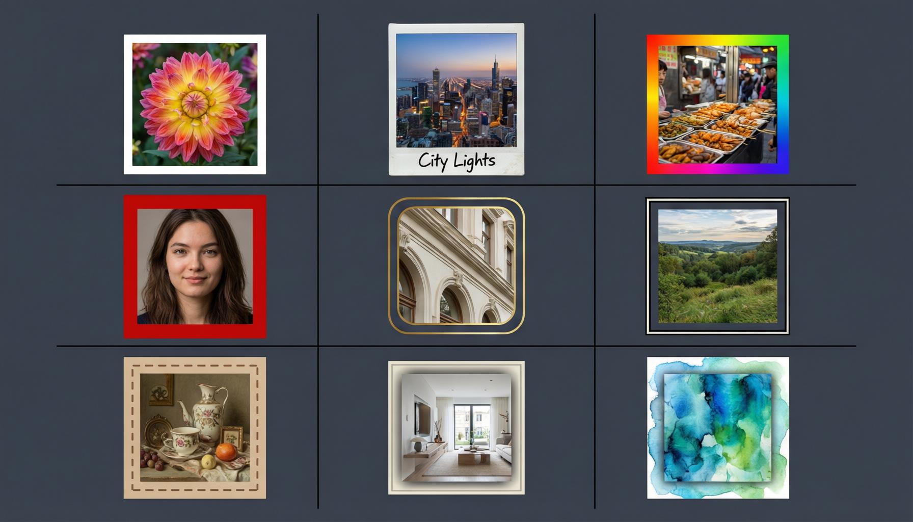
If you want to add clean white borders to your Instagram photos, make sure the final bordered image still fits the target aspect ratio. Adding a border to a photo changes its total dimensions, so account for that before uploading.
Twitter / X
Twitter's image handling trips up a lot of people because the timeline preview is not the same as the full image. This caused me real frustration early on — I would compose a beautiful landscape shot, only to see it aggressively cropped in the feed.
Single Image Tweets
When you attach a single image to a tweet, Twitter displays it in the timeline at a 16:9 ratio (up to 1600x900 pixels visible in the preview). The full image is accessible when someone clicks or taps on it, but that 16:9 preview is what most people will see. I compose and crop with this in mind — keeping the focal point centered so the timeline crop never cuts off anything important.
Multi-Image Tweets
When you attach 2 to 4 images, Twitter arranges them in a grid and each thumbnail crops to square (1:1) in the timeline. This is a completely different layout from the single image. If you are posting a photo set, test how each image looks as a square thumbnail before publishing. I have been burned by this more than once — a carefully composed landscape photo reduced to a square that cuts off both sides.
Header / Banner
The Twitter header is 1500x500 pixels (3:1 ratio). The tricky part is that your profile photo overlaps the bottom-left corner of the header. I keep all important visual content and text in the upper-right two-thirds of the banner to avoid that overlap zone. Always check your header on both desktop and mobile — the cropping behavior differs slightly between the two.
Facebook feels like it should be straightforward, but it has some of the most confusing image behavior of any platform, especially around cover photos.
Post Images
For feed posts, 1200x630 pixels (1.91:1 ratio) is the sweet spot, according to Facebook's official image guidelines. This works for both standalone image posts and link preview cards. Square images (1080x1080) also work well, especially on mobile where they take up more vertical space. I tend to use 1200x630 for anything link-related and 1080x1080 for standalone photos.
Cover Photos
This is where Facebook gets annoying. Cover photos display at 820x312 pixels on desktop and 640x360 pixels on mobile. Notice those are different aspect ratios. Desktop shows a wider, shorter strip. Mobile shows a narrower, taller one. There is no single upload size that fills both perfectly.
My approach: I upload at 820x360 pixels and keep all critical content — text, logos, faces — within the center 640x312 pixel area. That way nothing important gets cropped on either device. It is a compromise, but it works reliably.
Facebook Stories
Same as Instagram Stories: 1080x1920 pixels (9:16). Since Meta owns both platforms, the story infrastructure is essentially shared. Content formatted for Instagram Stories works directly on Facebook Stories without modification.
Ad tip: If you run Facebook ads, remember the old "20% text rule." Facebook no longer strictly enforces it, but images with less than 20% text still get better delivery and lower costs. I keep text minimal on ad images for this reason.
YouTube
YouTube is unique because image quality on the platform has an outsized impact on click-through rates. A well-sized, well-designed thumbnail is the single highest-leverage image you can create for your channel.
Thumbnails
Custom thumbnails should be 1280x720 pixels (16:9 ratio), with a minimum width of 640 pixels and a maximum file size of 2MB, per YouTube's official thumbnail guide. I cannot emphasize enough how much a custom thumbnail boosts CTR compared to YouTube's auto-generated frame grabs. After I started designing custom thumbnails for every video, my average CTR roughly doubled.
Design tips from experience: use high contrast, large readable text (no more than 5-6 words), and make sure the thumbnail is legible at the size of a postage stamp — because that is how most viewers will see it in their recommended sidebar on mobile.
Banners
YouTube banners are deceptively complex. The upload size is 2560x1440 pixels, but the visible area varies enormously by device. On a TV, the full image shows. On desktop, you see a wide strip. On mobile, only the center 1546x423 pixels are guaranteed to display. That safe zone is shockingly small relative to the full canvas.
I design my banners at the full 2560x1440 but treat the center 1546x423 as the "real" banner. Everything important — channel name, tagline, social handles, any text — lives inside that safe zone. The rest of the canvas gets a background or pattern that works even if it gets cropped.
Profile Photo
Upload at 800x800 pixels (1:1). YouTube renders it as a circle at various sizes depending on where it appears (channel page, comments, video page). A clean, recognizable face or logo works best at small sizes.
Pinterest is the one platform where vertical content is not just preferred — it is dramatically more effective than any other orientation. Understanding this changed how I approach Pinterest entirely.
Standard Pins
The standard pin format is 1000x1500 pixels (2:3 ratio). This is the format Pinterest optimizes for in its feed algorithm. Vertical pins take up more screen space as users scroll, which means more visibility and more repins. Horizontal or square pins get visually lost among all the tall vertical content — I have tested this with identical content in different orientations and the vertical version consistently outperforms.
Long Pins
Long pins use a ratio of about 1:2.1 (e.g., 1000x2100 pixels). These work well for infographics, step-by-step guides, and recipe cards. The caveat is that Pinterest may truncate very long pins in the feed with a "see more" prompt, which can actually help engagement (curiosity drives clicks) but means the bottom of your pin might not be immediately visible.
Idea Pins
Idea Pins are Pinterest's multi-page format, similar to Stories, at 1080x1920 pixels (9:16). Unlike Stories, they do not disappear after 24 hours. They are great for tutorials and step-by-step content where each page covers one step. I find they get strong engagement for educational content.
Pinterest tip: Always use a 2:3 aspect ratio for standard pins. The aspect ratio matters more on Pinterest than on any other platform because the entire feed layout is built around vertical cards.
LinkedIn's image handling has improved significantly over the past couple of years, but it still has its quirks. The professional context also means image quality matters more than on casual platforms — blurry or poorly sized images stand out negatively.
Post Images
For image posts, I use 1200x627 pixels (1.91:1) for link shares and 1080x1080 (1:1) for standalone images. Square posts perform noticeably better on mobile LinkedIn, where most people browse. The 1.91:1 ratio is really only necessary for link preview cards where you want the image to match the expected OG image dimensions.
Personal Profile Banner
Your personal LinkedIn banner should be 1584x396 pixels (4:1 ratio). Like Twitter, your profile photo overlaps the bottom-left corner of the banner. I keep branding and text in the right half to avoid the overlap. LinkedIn compresses images pretty aggressively, so I upload at the full recommended size and sometimes a touch larger to compensate.
Company Page Banner
Company page banners are 1128x191 pixels, which is an extremely wide and short strip — nearly a 6:1 ratio. This is one of the most awkward image formats on any platform. Keep text centered and minimal. Logos with horizontal layouts work better than vertical or square ones here.
Profile Photo
Upload at 400x400 pixels (1:1). It displays as a circle. On LinkedIn, a professional headshot is expected — not a logo, not a group photo, not a landscape. The platform's professional context means your profile photo is essentially your digital first impression.
Common Mistakes I See
After years of reviewing social media content and managing my own, these are the mistakes I encounter most often. If you avoid these, your images will already look better than the majority of what gets posted.
Using landscape photos on Instagram
Landscape images (1.91:1) look tiny in the Instagram feed. They occupy maybe half the vertical space of a square post and a third of a 4:5 portrait post. Unless the photo genuinely needs a wide format, this is a wasted opportunity. Crop to 4:5 or 1:1 and give your image the screen presence it deserves.
Not checking the mobile preview for Twitter headers
Twitter headers crop differently on desktop and mobile. I have seen so many headers where the text or focal point is perfectly positioned on desktop but completely cut off on a phone. Always check both before committing to a header design.
Forgetting YouTube banner safe zones
The YouTube banner safe zone is surprisingly small. Many creators design a gorgeous full-width banner and then wonder why most of it is invisible on mobile. If your channel name or tagline is anywhere outside the center 1546x423 pixel area, a large portion of your audience will never see it.
Uploading tiny profile photos that look blurry
Every platform displays profile photos as circles, and every platform compresses them. If you upload a 200x200 profile photo, it will look soft and pixelated on retina displays. Upload at minimum 400x400, ideally 800x800, so the platform has enough resolution to display it sharply even after compression.
Ignoring the Facebook cover photo desktop/mobile difference
This is the single most common cover photo mistake. People design for desktop dimensions, check it on their laptop, and publish. Then they open the Facebook app on their phone and realize half the banner is cropped. Design for both simultaneously using the 820x360 upload with a centered safe zone.
My Workflow for Getting Sizes Right
Over time I have developed a workflow that minimizes sizing mistakes across platforms. It is not complicated, but it does require a bit of discipline.
Shoot in multiple orientations. When I am photographing something I know will go on social media, I take the shot in both landscape and portrait. This gives me flexibility later. A landscape shot that looks great on Twitter might need a portrait crop for Instagram, and having both orientations from the start saves me from awkward crops.
Leave bleed room. I never put critical content (text, faces, logos) right at the edge of an image. Every platform crops differently, and some compression happens at the pixel level. Leaving 5-10% padding around the edges ensures nothing important gets cut.
Use the AdBorder Size Checker before posting. Before I upload anything, I run it through the AdBorder Size Checker to verify the exact dimensions. It takes two seconds and has saved me from uploading incorrectly sized images more times than I can count.
Add borders to fit aspect ratios. When an image does not quite match the target aspect ratio, instead of cropping and losing content, I add a border to pad it to the right dimensions. White borders work universally and maintain a clean look. AdBorder makes this fast — upload, select the border style and width, and download. The entire process takes under 30 seconds. Read more about adding borders for Instagram or the general photo border guide for deeper techniques.
Keep a cheat sheet. I keep the quick reference table from this article bookmarked on my phone. When I am on the go and need to quickly resize something, I pull it up rather than trying to remember every dimension from memory. If you are reading this, bookmark this page — that is exactly what it is designed for.
Choosing the Right Image Format
Beyond dimensions, the file format you upload matters. For social media, the practical choice is almost always JPEG for photographs and PNG for graphics with text, sharp edges, or transparency. I wrote a full breakdown of image formats and when to use each one if you want the details, but the short version is: use JPEG for photos (smaller file size, faster uploads) and PNG for anything with text overlays, borders, or graphics where compression artifacts would be visible.
Check Your Image Size Instantly
Not sure if your image is the right size for a platform? Drop it into the AdBorder Size Checker and it will tell you the exact pixel dimensions instantly. No upload to a server — everything runs in your browser. If the dimensions do not match your target platform, you can add a border to pad the image to the correct aspect ratio right there in the same tool.
Frequently Asked Questions
What is the best image size for Instagram posts in 2026?
For Instagram feed posts, the two main sizes are 1080x1080 pixels (1:1 square) and 1080x1350 pixels (4:5 portrait). I recommend the 4:5 portrait format because it occupies roughly 30% more screen space in the feed, which translates to higher engagement. For Stories and Reels, use 1080x1920 pixels (9:16). Always export at 1080px wide since Instagram recompresses images regardless of upload resolution.
Why do my Twitter/X images look cropped in the timeline?
Twitter crops image previews in the timeline to a 16:9 ratio for single images and uses a 1:1 square crop when you attach 2-4 images. The full uncropped image is only visible when someone clicks on it. To avoid surprises, keep critical content centered and use 1600x900 pixels for single-image tweets. For multi-image posts, assume each thumbnail will be square.
What is the correct YouTube banner size and safe zone?
YouTube banners should be 2560x1440 pixels, but the safe zone that displays across all devices is only 1546x423 pixels, centered in the canvas. This is because YouTube shows different amounts of the banner depending on whether the viewer is on a TV, desktop, or phone. Keep all text, logos, and important visual elements within that center safe zone to guarantee they are visible everywhere.
What are the Facebook cover photo dimensions for desktop and mobile?
Facebook cover photos display at 820x312 pixels on desktop and 640x360 pixels on mobile. Because these aspect ratios differ, Facebook crops the image differently on each device. The safest approach is to upload at 820x360 pixels and keep critical content in the center 640x312 pixel area so nothing important gets cut off on either device.
Why is vertical content better on Pinterest?
Pinterest is a vertical scrolling feed, so vertical pins with a 2:3 aspect ratio (like 1000x1500 pixels) naturally occupy more screen real estate and get more engagement. Horizontal or square pins get lost among the tall vertical content. Long pins at 1:2.1 ratio can also perform well for infographics, but standard 2:3 pins are the most reliable format for consistent reach.
What image sizes work best for LinkedIn posts and company pages?
For LinkedIn post images, use 1200x627 pixels (roughly 1.91:1) for link previews or 1080x1080 pixels for square image posts. Company page banners should be 1128x191 pixels, and personal profile banners 1584x396 pixels. LinkedIn compresses images heavily, so uploading at the recommended size with some extra resolution helps maintain sharpness. Profile photos display as circles at 400x400 pixels.
Ready to check your images? Use the AdBorder Size Checker to verify your image dimensions instantly, then add clean borders to match any platform's aspect ratio. Free, no signup, no watermark — just drag, drop, and go.