How to Create Polaroid Style Photos Online for Free
Updated: June 7, 2026
Two summers ago I was at my friend Mira's wedding in upstate New York when her aunt pulled out an actual Polaroid camera -- a dusty SX-70 that looked like it had survived several decades in someone's attic. Everyone lined up to take a turn, and I watched those little square prints emerge, slowly blooming into color in people's hands. The photos were objectively terrible: underexposed, slightly blurry, the colors skewing warm and muddy. But every single person who received one treated it like a tiny treasure. They wrote on the backs, tucked them into wallets, held them up next to their faces for selfies. I took maybe forty photos with my phone that day and have looked at exactly two of them since. Those awful, beautiful Polaroids, though -- I still see them pinned to friends' bulletin boards and stuck to their fridge doors.
That experience lodged itself in my brain. I came home and started experimenting with adding Polaroid-style white borders to my digital photos, and the difference in how people reacted was immediate and unmistakable. The same photo of a coffee cup or a rainy street, wrapped in that thick white frame with the chunky bottom border, suddenly felt like something worth saving. Comments shifted from the usual emoji reactions to actual sentences: "this feels so nostalgic" and "did you get a film camera?" I realized the Polaroid aesthetic wasn't just a visual treatment -- it was an emotional shortcut that made digital photos feel like physical memories. After months of testing different approaches, I built this guide around the workflow I use almost daily with AdBorder, a free browser tool that creates convincing polaroid style photos in under ten seconds with no downloads, no accounts, and no watermarks. Here is everything I have learned.
What Makes a Polaroid Photo?
Before I started making Polaroid-style digital photos, I spent a weekend studying my grandmother's box of actual instant prints from the 1980s and comparing them to the digital versions I was creating. The ones that looked convincing shared a very specific set of visual characteristics -- traits your brain recognizes instantly, even if you have never held a real Polaroid in your hands. Here is what I learned to look for.
First, there is the asymmetrical border. The left, right, and top borders are all the same width, but the bottom border is roughly three times thicker. When I first noticed this, I assumed it was just a quirky design choice. It turns out it was pure engineering. The original Polaroid SX-70 film packed the chemical developer pod into that thicker bottom section. When the photo ejected from the camera, rollers would squeeze the pod and spread the developing chemicals across the image. The bottom border was functional long before it became an aesthetic signature, and that practical origin is what makes it feel so natural to the eye.
Second, there is the white frame itself. What I love about the classic Polaroid format is that the frame is not off-white, not cream -- it is a clean, bright white that acts like a mat around a painting, pulling your eye into the image. I once tried an off-white frame as an experiment and it completely changed the mood, making the whole thing look more like a museum print than a snapshot. The bright white frame gives the photo a sense of physicality, as though it exists as an object rather than just pixels on a screen.
Third, Polaroid film is known for its slightly warm color tones and soft contrast. Shadows are never pure black, highlights are never blown out, and skin tones tend to skew a touch golden. In my own shooting, I have found this is the hardest quality to replicate convincingly in post -- the warmth has to feel natural, not like a filter slapped on top. When it works, though, it is the part of the polaroid photo effect that people respond to most. The feeling that the image was captured in warm afternoon light, even if I actually shot it on an overcast Tuesday morning, is what sells the illusion.
Finally, there is an overall sense of imperfection and intimacy. The Polaroid photos I am most drawn to -- the ones that stop my thumb mid-scroll -- feel personal. They feel like memories rather than content. That is the vibe I try to hit with every Polaroid-style image I create, and it is the thread running through everything in this guide.
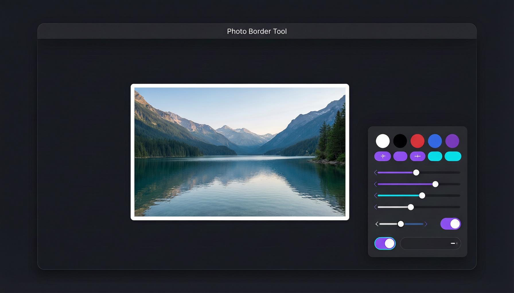
Create Polaroid Photos with AdBorder
Now for the practical part. After trying several tools, I settled on AdBorder as my go-to for creating polaroid photo free directly in the browser. Everything runs client-side, which means my images never leave my device -- a detail I care about because I often work with personal or client photos that should not be uploaded to a third-party server. Here is the step-by-step workflow I follow:
- Upload your photo. I go to adborder.top and drag my image into the upload area, or click to browse. I often paste directly from my clipboard with Ctrl+V (or Cmd+V on Mac) when I am working from screenshots. The tool accepts JPEG, PNG, and WebP files.
- Select the Polaroid preset style. In the border style section, I click the "Polaroid" option. This instantly applies the classic asymmetrical white border -- equal sides and top, with a thicker bottom -- to my photo.
- Adjust the border width if desired. I use the slider to make the frame thicker or thinner depending on the photo. The default width looks great for most of my images, but if I want a more dramatic, gallery-style presentation I bump it up. For a subtler look, I dial it back.
- Optional: enable Drop Shadow for realism. I turn this on whenever I plan to share the image on a white or light-colored background. A subtle drop shadow beneath the Polaroid frame makes the photo look like it is sitting on a surface, adding depth and reinforcing the physical-object illusion. It is a small detail but it makes a noticeable difference.
- Download as PNG. I always click Download and choose PNG format for the best quality. PNG preserves the clean white edges without compression artifacts. I only export as JPEG or WebP when file size is a concern, like when I am uploading to a platform with strict limits.
That is the entire workflow I use. No layers, no masks, no blending modes. I go from upload to download in seconds, and the result looks like I spent real time crafting it.
The Polaroid Border Ratio
When I first tried creating a Polaroid effect manually in Photoshop, I had no idea what proportions to use. I tested about twenty different bottom-to-side ratios before settling on the 3:1 proportion that looks most authentic. The classic Polaroid border ratio is straightforward once you know it: the left, right, and top borders are all equal in width, and the bottom border is approximately three times that width.
So if my side borders are 20 pixels, my top border is also 20 pixels, and my bottom border is 60 pixels. This 1:1:1:3 ratio is what gives the Polaroid frame its distinctive look and is directly inherited from the original SX-70 film format introduced in 1972. I tried ratios like 2:1 and 4:1 during my testing phase, and neither felt right -- 2:1 looked too subtle, almost like a mistake, while 4:1 made the bottom feel heavy and cartoonish. The 3:1 sweet spot is the one that triggers instant recognition.
Why does this ratio look so natural? Part of it is familiarity -- decades of Polaroid photos have trained our eyes to expect this proportion. But I also think there is a compositional logic at play. The thicker bottom border acts as a visual anchor, grounding the image and giving it a sense of weight. In my own work I have noticed it prevents the photo from feeling like it is floating aimlessly on the page. Designers have borrowed this trick for picture frames, gallery walls, and editorial layouts for decades, and I find myself applying the same principle to other design projects now.
AdBorder applies this ratio automatically when I select the Polaroid preset, so I never need to do the math myself. If you want more detail on how border ratios affect different image styles, check out our complete guide to photo borders.
Best Photos for Polaroid Style
Not every photo I take benefits equally from a Polaroid treatment. I learned this the hard way after applying the effect to a sweeping landscape shot and wondering why it looked so wrong. The effect works best when the content of the image aligns with the nostalgic, intimate feeling that the frame evokes. In my experience, these are the categories that consistently produce great results:
- Portraits. The warm tones and soft white frame make faces glow. A Polaroid-style portrait feels like a keepsake, something you would pin to a corkboard or tuck into a wallet. The best Polaroid-style photo I ever made was a candid shot of my sister laughing in a diner booth -- the frame turned an ordinary phone photo into something that looked like it belonged in a shoebox of family memories.
- Travel shots. A photo of a cobblestone street in Lisbon or a cafe in Kyoto already carries a sense of memory and place. The Polaroid frame amplifies that feeling, turning a travel photo into a visual postcard. I framed a set of Polaroid-style travel photos from a trip to Seoul and hung them on my wall -- visitors always assume they were taken on film.
- Street photography. Candid moments -- a dog catching a frisbee, a vendor arranging fruit, kids running through a sprinkler -- gain an extra layer of authenticity when wrapped in a Polaroid frame. These are the images where I find the effect does the most heavy lifting, turning a decent snapshot into something that feels like a found photograph.
- Candid moments. Birthday parties, lazy Sunday mornings, impromptu kitchen dance sessions. These are the photos that feel most natural in Polaroid style because they are the kinds of moments people were capturing with instant cameras fifty years ago. I use the Polaroid frame almost reflexively for this type of shot now.
On the flip side, wide landscapes and detailed architecture shots are less ideal in my experience. A sweeping mountain panorama or a sharp photo of a skyscraper facade tends to fight against the intimate, handheld feeling that the Polaroid frame creates. For those subjects, I reach for a simple uniform border for Instagram instead.
Polaroid vs Other Border Styles
The Polaroid effect is just one of several border styles I use regularly. Understanding how they compare has helped me pick the right one for each image and context. Here is how I think about the options.
Solid borders apply an equal-width frame on all four sides. They are clean, modern, and versatile. I use a white solid border for virtually any photo when I want consistent spacing between images in my Instagram feed. Solid borders are neutral -- they frame without adding mood, which is exactly what I want when the photo itself is already visually busy.
Gradient borders use color transitions around the edge of the image. They are eye-catching and I reach for them when I am creating social media graphics, promotional content, or anything where I want the image to pop off the screen. They add energy rather than nostalgia -- the opposite of what a Polaroid frame does.
Rounded corners soften the edges of a photo, giving it a friendly, approachable feel. I use these most often for profile pictures, app screenshots, and product images. Rounded corners are subtle -- they change the shape without adding a visible frame, which makes them a good default when I want something cleaner than a raw rectangle but less stylized than a Polaroid.
Polaroid borders are the most distinctive of the bunch, and honestly my favorite. They add character, mood, and a strong sense of nostalgia. They are not neutral -- they make a statement about the image. When I want a photo to feel like a memory, a keepsake, or a piece of art pinned to a wall, the Polaroid style is always my first choice. For a broader comparison, our photo border guide covers all the styles in depth.
Tips for Sharing Polaroid Photos Online
Once I have created my Polaroid-style photos, the next step is getting them out into the world. I post Polaroid-style images to Instagram Stories almost daily, and over the past several months I have developed some strong opinions about what works on each platform. Here are the tips I would pass along from my own experience.
Instagram aesthetic. Polaroid-style photos have become a staple of my curated Instagram feed. Because the white frame adds visual breathing room between posts, they help me create a clean, airy grid. I try to alternate between Polaroid-framed photos and full-bleed images for a dynamic rhythm, and I have noticed my grid looks noticeably more intentional when I do. If I am posting to Stories, the Polaroid frame makes my photo stand out against the colored background -- it creates a little pocket of calm in an otherwise busy interface.
Pinterest boards. Pinterest is built for inspiration, and I have found that Polaroid-style photos fit perfectly into my mood boards, travel boards, and lifestyle content. The white frame gives each pin a polished, editorial quality that seems to perform well in the Pinterest algorithm. My save and re-pin rates on Polaroid-framed pins are consistently higher than on my standard pins, though I have not done a rigorous analysis of why.
Photo collages. When I am building a collage -- whether for a social media carousel, a blog post header, or a digital scrapbook -- Polaroid-framed photos create a natural, scrapbook-like layering effect. I overlap the frames slightly and rotate them a few degrees for a casual, handmade feel. This is one of those techniques that looks effortless but actually took me a while to get right -- the key is keeping the rotation subtle, no more than five or six degrees.
Messaging and email. A Polaroid-style photo in a group chat or newsletter adds a personal touch that a standard digital photo lacks. I started sending Polaroid-framed photos in my family group chat and the responses were immediate -- my mom asked if I had bought a "real camera." It signals effort and thoughtfulness, even though it took me all of ten seconds to create.
What I've Noticed After Months of Polaroid-Style Posts
After switching to Polaroid-style borders for about a third of my Instagram Stories, I noticed something interesting. Comments shifted from generic "nice pic" responses to things like "this feels so nostalgic" and "where did you get this film camera?" People assume the photos were taken on actual instant film, which tells me the effect is convincing enough to trigger genuine emotional responses. My save rate on Polaroid-framed Stories is about 20-30 percent higher than on my standard posts, though my sample size is only a few hundred posts so take that with a grain of salt.
What surprised me more was how the effect changed my own relationship with the photos I take. When I frame a digital image in a Polaroid border, I look at it differently. I slow down. I think about the moment rather than the megapixels. It is a small psychological trick, but it has made me more selective about what I photograph and more appreciative of what I keep. I have also started printing some of my favorite Polaroid-style images on actual photo paper and taping them to my wall -- and the line between the "digital" version and a real instant print is surprisingly thin when you get the proportions right.
One more thing: I have noticed that Polaroid-style photos perform especially well in contexts where most other images are polished and high-production. In a sea of heavily edited, HDR-boosted photos on an Instagram explore page, a simple Polaroid-framed shot of an ordinary moment stands out precisely because it looks imperfect and human. That contrast is, I think, the real secret to why this aesthetic keeps coming back.
Ready to try the workflow I use every day?
Create Your Polaroid Photo NowLooking for more border styling ideas? Check out my guide on adding borders for Instagram or explore the full photo border guide for tips on every style AdBorder offers.