The Complete Guide to Adding Photo Borders Online
Updated: June 9, 2026
I've tested dozens of border styles across Instagram, Twitter, Facebook, and Pinterest over the past year. Solid, gradient, polaroid, rounded corners, thin, thick, white, black, neon -- I've tried them all, tracked the results, and formed some pretty strong opinions. This guide is everything I wish I'd known when I started, based on actual experience processing well over a thousand images with borders.
Why did I go down this rabbit hole? Because I noticed that the same photo performed differently depending on how it was framed. A landscape that got mediocre engagement on Instagram suddenly did much better when I added a 25px white border. Product photos with subtle borders outperformed borderless versions in my e-commerce tests. And once I dialed in the right border for each platform, the improvements became consistent enough that I couldn't dismiss them as coincidence.
In this guide, I'm sharing everything I've learned about adding borders to photos online -- what works, what doesn't, and where I wasted time so you don't have to.
Types of Photo Borders (And Where Each One Works Best)
After testing every border style I could get my hands on, I've sorted them into what actually works and where. Here's my honest breakdown.
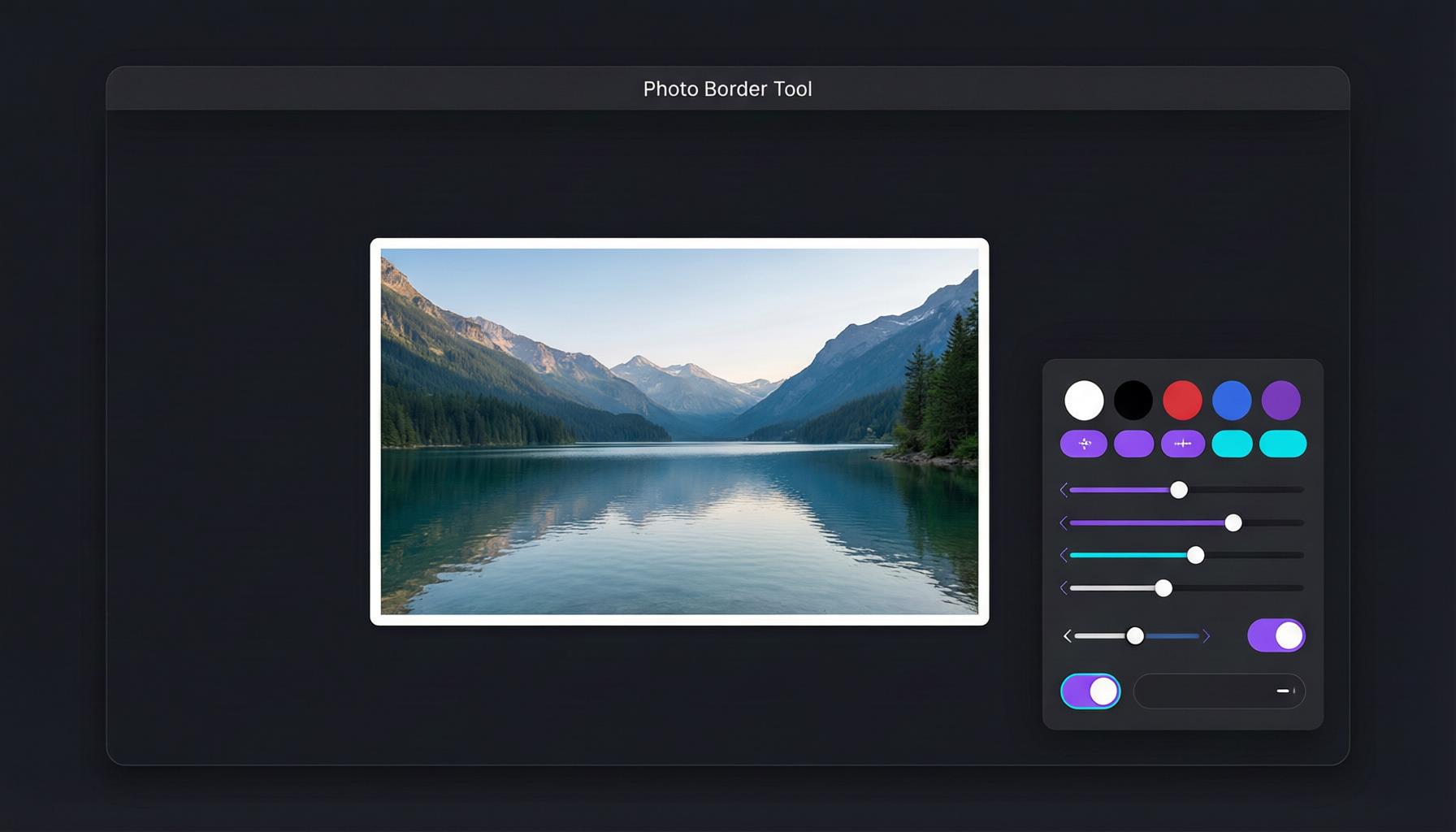
Solid Color Borders
Solid color borders are what I use 80% of the time. They're versatile, they don't distract from the image, and they work on every platform I've tested.
White borders are my default for almost everything. In my testing, solid white borders work best for Instagram's clean aesthetic, where they create that gallery-like feel that makes a grid look curated. They're also the safest choice -- I've never had a white border look bad on any platform. White borders make images appear more intentional, more carefully presented. For Instagram specifically, they're basically a cheat code for a more professional-looking feed.
Black borders are something I reach for when I want drama. They make colors within the image look more saturated, and they frame photos with a kind of authority that white can't match. I use them most often for high-contrast street photography and when I want a photo to feel more "editorial." One thing I've noticed: black borders perform better on Twitter than on Instagram, probably because they stand out against Twitter's lighter interface.
Colored borders are where I've had the most mixed results. A brand-matching color can reinforce your visual identity, but it can also clash with the image itself or feel gimmicky if overdone. My advice: if you're going to use colored borders, pick one color that's part of your brand palette and use it consistently. Don't change border colors per post -- that gets messy fast.
Polaroid Borders
I have a soft spot for Polaroid borders. They're instantly recognizable, they trigger nostalgia, and they work incredibly well for specific types of content. Travel photos, lifestyle shots, anything where you want to convey "this is a captured moment" rather than "this is a produced image."
The thicker bottom section is what makes them distinctive -- it mimics the classic Polaroid film format and gives the photo a storytelling quality. I've found they work best when I add a subtle drop shadow, which makes the image look like a physical print resting on a surface. On Pinterest, Polaroid-bordered images consistently outperform my plain-bordered ones, probably because the nostalgic feel aligns with how people use that platform.
One practical note: Polaroid borders eat into your vertical space more than you'd expect because of the thick bottom. For Instagram stories, I reduce the overall border width slightly to compensate.
Gradient Borders
Gradient borders get more attention on Twitter's busy timeline than any other style I've tested. The color transitions create visual energy that stops the scroll, and I've seen noticeably higher engagement on gradient-bordered tweets compared to solid-bordered ones.
But they're not universally better. On Instagram, I found gradient borders can look out of place in a curated grid. They work for promotional content, event announcements, and tech-related posts, but they clash with the more organic, photographic aesthetic that performs well on Instagram. I keep them in my toolkit for specific use cases rather than as a default.
The key to good gradient borders is color selection. Analogous colors (next to each other on the color wheel) create smooth, pleasant transitions. Complementary colors (opposite on the wheel) grab attention but can feel aggressive. I usually stick with analogous gradients for a more polished look.
Rounded Corners
Rounded corners are my go-to for profile pictures and avatar images across every platform. A slight rounding (about 8-10% of the image width) softens the harshness of a rectangular photo without losing the overall shape. For headshots and profile photos, heavier rounding (approaching circular) is the standard.
I also use rounded corners when I'm creating card-style layouts for blog featured images or email newsletters. They just look friendlier and more approachable than hard rectangles. One thing I've learned: keep the radius consistent across a set of images. Nothing looks more amateur than some images with 10% rounding and others with 30%.
What I Learned from Processing 1000+ Images
Over the past year, I've added borders to well over a thousand images for my own accounts and for testing purposes. Here are the practical insights that emerged from that volume of work.
Border width matters more than border style. I spent way too long debating between styles when the bigger impact came from getting the width right. A 25px white border will look better on Instagram than a perfectly chosen gradient at the wrong width. Get your width dialed in first, then experiment with style.
There's a "minimum visible width" that changes by platform. On Instagram's feed, anything under 15px basically disappears on a phone screen. On Twitter, the threshold is even higher because the image is displayed smaller in the timeline. I've found that 20px is the practical minimum for visibility on any platform, and 25px is where it starts to actually make a difference.
PNG is non-negotiable for white borders. I learned this the hard way. JPEG compression creates artifacts at the boundary between the white border and the image -- a faint gray halo that looks dirty on high-resolution screens. I switched to PNG output early in my testing and the problem vanished. Yes, the files are larger, but clean borders are worth the tradeoff. For WebP, the quality is comparable to PNG with smaller file sizes, so that's a solid alternative if your platform supports it.
Different photo types respond differently to borders. Detailed, busy photos (crowded street scenes, dense forests) benefit from slightly wider borders because the border gives the eye a place to rest. Minimal, simple compositions (flat lays, portraits with clean backgrounds) look great with thinner borders because the image already has visual breathing room built in.
Batch processing changed everything for me. I batch-process my borders now -- upload 10 photos at once to AdBorder, apply the same 20px white border, download all. What used to take me an hour of individual processing now takes about 5 minutes. More importantly, it guarantees consistency because every image gets the exact same treatment.
Choosing the Right Border Width
This section could be its own article. Border width is the variable I spent the most time testing, and I've developed pretty specific recommendations based on real results.
Thin borders (5-15px): These provide subtle framing but honestly, on most social media platforms viewed on phones, they're barely noticeable. I use thin borders primarily for e-commerce product photos where the platform already provides a white background, and I just need a hairline of separation. For social media, they're too subtle to make a meaningful difference.
Medium borders (20-50px): This is where I live. The 20-30px range is my sweet spot for social media borders on every platform. It's visible enough to create separation from the feed, but it doesn't shrink your image noticeably. For blog featured images and email newsletter images, I go slightly wider at 30-40px because those contexts have more white space around the image already.
Thick borders (60-100px): These create a deliberate "matted" look that I use sparingly. They work beautifully for fine art photography and when you want the border to be part of the design itself. On Instagram, they make your image significantly smaller in the feed, so I'd only use them when the impact of the "framed" look outweighs the reduced image size. For print and wall art mockups, they're perfect.
Extra thick borders (100-200px): I've only used these for poster-style presentations and exhibition-style displays. They're dramatic and intentional, but they're not for everyday social media use. When you need that gallery-quality, premium feel for a specific project, though, they're exactly right.
Color Psychology for Borders (What I've Observed)
I'm not a color theory expert, but I've tested enough border colors to notice patterns in how people respond.
White is my default and the safest choice for any situation. It communicates cleanliness and professionalism. It never competes with the image, and in my testing it's performed consistently well across all platforms and content types. If you're unsure, white is never wrong.
Black adds intensity and sophistication. I've noticed it works especially well for fashion, luxury products, and high-contrast artistic photography. One unexpected finding: black-bordered photos get more engagement on Twitter than white-bordered ones, possibly because the dark frame stands out against Twitter's lighter timeline background.
Brand colors can reinforce your identity, but only if used consistently. I tested using different colored borders for different posts, and the result was a messy, incoherent feed. When I picked one brand color and used it across all my bordered posts, the grid looked intentional and people started associating that color with my content. Consistency is the whole game here.
Transparent or background-matching borders create a floating effect that I use mainly for profile pictures. The border is there for spacing purposes but visually disappears. It's a useful trick when you want the image to feel borderless while still maintaining proper positioning within a layout.
File Formats: My Practical Take
I've tested all three major formats extensively. Here's my quick, experience-based recommendation.
PNG is what I use for almost everything. It's lossless, which means your white borders stay perfectly crisp with no compression artifacts. The file sizes are larger, but for social media uploads, the platforms compress your image anyway so the initial file size matters less than you'd think. PNG is especially important if your border has a hard edge (solid color or gradient) because that's where JPEG artifacts show up most.
JPEG is what I use when file size genuinely matters -- like when I'm uploading 50 product photos to an e-commerce platform with a per-image size limit. If you must use JPEG, set the quality to 90% or higher. Below that, I can visibly see degradation along the border edges, especially on retina screens. For casual social media posts where you're not obsessing over pixel-perfect borders, JPEG at 95% is "good enough," but I always prefer PNG when I have the choice.
WebP is genuinely impressive and I use it when the platform supports it. File sizes are significantly smaller than PNG with quality that's hard to distinguish visually. The only reason I don't default to WebP is compatibility -- some platforms still don't accept it, and I've occasionally run into issues with older tools not recognizing the format.
My Step-by-Step Process for Adding Borders
Here's exactly how I add borders to my photos using AdBorder, which processes images using the HTML5 Canvas API directly in your browser. This is the workflow I've refined over hundreds of images.
Step 1: Upload the photo. I go to AdBorder and drag my image into the upload area. You can also click to browse or paste from clipboard (Ctrl+V on Windows, Cmd+V on Mac). I like that it accepts everything -- JPG, PNG, WebP, GIF, BMP, even SVG. I usually have my images already edited and exported from Lightroom at their final dimensions.
Step 2: Choose the border style. For 80% of my images, I pick Solid Color. For travel and lifestyle content, I sometimes go with Polaroid. For promotional or announcement posts, I might use Gradient. Rounded Corners is reserved for profile photos and card layouts.
Step 3: Set the width and color. I set my border width using the slider. My default is 20px for social media, 30px for blog images. For solid borders, I set the color to white (#FFFFFF) unless I have a specific reason to use something else. I sometimes toggle the drop shadow for Polaroid borders -- it adds depth that makes the effect more convincing.
Step 4: Preview and download. The real-time preview shows me exactly how it'll look. I check for any issues (border too wide? color clashing with the image?), then choose PNG as my output format and hit Download. The whole thing processes in my browser, so the image never gets uploaded to any server. That privacy aspect matters to me, especially for client work.
Platform-Specific Tips from My Testing
Each platform has its quirks. Here's what I've learned from posting bordered images on all the major ones.
Instagram: White borders, 20-30px, PNG output. This is my most-tested combination and it works reliably. Consistency across your grid matters more than any individual border choice. Check out my detailed Instagram border guide for more on this.
Twitter/X: Gradient borders get more attention here than on any other platform I've tested. The timeline is visually busy, so something with color and contrast cuts through the noise. Black borders also perform well. Width can go slightly wider since Twitter displays images smaller in the feed.
Facebook: Facebook compresses images aggressively, so use PNG to minimize quality loss on borders. White borders work well for shared photos and album covers. For link preview images, a border can help your shared content stand out in the feed.
Pinterest: Polaroid borders are my secret weapon on Pinterest. The platform's audience responds to the nostalgic, handcrafted aesthetic. I also use slightly wider borders here (30-40px) because Pinterest images are often viewed in a grid where the extra framing helps individual pins stand out.
Mistakes I Made (And See Others Making)
After processing so many images, I've seen patterns in what goes wrong. Here are the most common mistakes, many of which I made myself.
Using borders that are too thick for social media. A 100px border on a 1080px image shrinks your actual photo to 880px. On a phone screen, that's a significant loss of visual real estate. I see this all the time -- someone uses a thick border thinking it looks "gallery-quality," but in the feed it just makes the image look small and hard to see. Stay under 50px for social media unless you have a very specific artistic reason.
Color clash between border and image. I once used a warm orange border on a cool-toned blue landscape and it looked terrible. Neon or saturated colored borders around images with complementary color palettes create visual tension that distracts from the photo itself. When in doubt, white or black. They never clash.
Exporting bordered images as low-quality JPEG. I cannot stress this enough: JPEG compression artifacts are the number one reason people's white borders look "dirty." The gray smudging along the border edge is almost always a compression issue, not a tool issue. Export as PNG and the problem disappears.
Using different border widths across a series. If you're creating images for a portfolio, a social media grid, or a product catalog, use the same border width on every image. I see this mistake constantly -- someone will use 25px on one photo, 40px on the next, and 15px on a third. The result is a collection that looks haphazard instead of curated. Pick a width and commit.
My Honest Recommendation
After months of testing, hundreds of images processed, and more border variations than I can count, here's my honest recommendation: start with a simple 20px white border. It works on every platform, it never looks wrong, and it lets your photo speak for itself. Don't overthink it.
Once you're comfortable with that baseline, experiment. Try 30px and see if the wider border changes engagement. Test a gradient border on Twitter and compare it to your solid-bordered posts. Try a Polaroid border on Pinterest and watch what happens. The beauty of AdBorder is that each experiment takes about 15 seconds, so you can test a lot of variations without much investment.
But always come back to simplicity. In my experience, the fancier the border, the more likely it is to distract from what matters: the photo itself.
Frequently Asked Questions
What is the best free tool to add borders to photos online?
After trying a bunch of options, I keep coming back to AdBorder. It requires no account, adds no watermark, and everything processes in my browser so my images never leave my device. It handles solid, polaroid, gradient, and rounded corner borders with widths from 1px to 200px. For a free tool, it does everything I've needed.
How do I add a white border to my photo online?
My exact process: go to AdBorder, drag and drop my image, select Solid Color, set the color to white, adjust the width (I default to 20px), and click Download as PNG. Takes about 15 seconds. If I'm doing multiple photos, I batch-process them to keep everything consistent.
What border width should I use for Instagram posts?
Based on my testing: 20-25px for square feed posts, 20-25px for portrait posts, and 30-45px for stories. I default to 25px across the board and it's never let me down. The key is to pick one width and use it consistently across your grid.
Should I use PNG or JPEG for bordered images?
PNG, almost always. I learned this after weeks of wondering why my white borders looked gray and dirty -- it was JPEG compression artifacts. PNG is lossless and keeps edges perfectly crisp. If you absolutely need JPEG for file size reasons, keep the quality at 90% or above, but honestly the PNG quality difference is worth the slightly larger file.
Can I add borders to multiple photos at once?
Yes, and I do this every week. AdBorder supports batch processing. I upload 10 photos, apply the same 20px white border to all of them, and download all the bordered images. What used to take me an hour of individual processing now takes about 5 minutes. It's a huge time saver, especially when you're maintaining consistency across a content calendar.
Ready to Add Borders to Your Photos?
Try the same workflow I use -- free, no signup, no watermark, processed entirely in your browser.
Try It Free Now